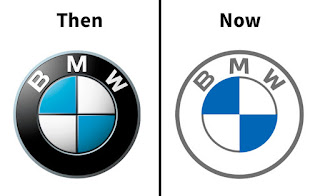
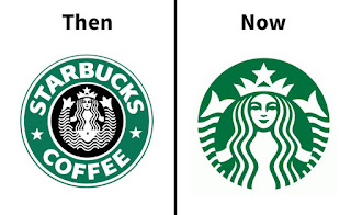
Times change, opinions
evolve (or devolve), and businesses need to adapt. Whether they want it or not,
modernity creeps up on everyone and there are plenty of successful examples of
such adaptations. Companies change their policies to fit the times, ensure
their values match society's, and in general, receive praise for their efforts
to pull their business practices into modernity.
However, in some cases,
the desire to renew oneself with the times comes with a few steps backwards. A
good example would be a change in a company's logo those are usually easier to
redesign than inner workings or policy, but they also display some movement forward,
so plenty of businesses jump at the chance to showcase their newfound modern
outlook.
However, sometimes eagerness to appear more in with the times and attempts to modernize the look of well-established brands end up creating something that feels flat and without any of the original flair. In some cases, it can be a change of color scheme, going from a bright and vibrant design to a black-and-white and muted logo that doesn't look anything like its source. And sometimes it's the overall simplification of the logo's design that turns it unrecognizable older companies tended to have detailed logos, which were great to look at, but with the times and automatization, the logo ends becoming more flat (a good example would be Warner Bros' logo).
1. BT Group2. Warner Bros.3. Burger King4. Gmail5. Holiday Inn6. General Motors7. Pringles8. Nickelodeon9. BMW10. Petco11. J.m. Smucker12. Starbucks13. Pepsi14. Hellofresh15. Wawa16. Best Western17. Wendy's18. Mountain Dew19. Yahoo!20. Staples21. Google22. Procter & Gamble23. International House Of Pancakes24. Taco Bell25. Citroën26. Olive Garden27. Los Angeles Rams28. Blue Point Brewing Company29. The Metropolitan Museum Of Art30. Airbnb31. Berluti32. Syfy33. Burberry34. Yves Saint Laurent35. US Open36. Meetup37. Disney Channel38. Black & Decker39. Deviantart40. Balmain41. Northwest Airlines42. Balenciaga


No comments:
Post a Comment